Redmond: A Distinctive Retro Serif Font for Digital Branding
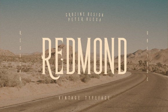
As a UI designer who builds landing pages, SaaS dashboards, and e-commerce experiences, I’ve learned that typography isn’t just about aesthetics—it’s functional infrastructure. Redmond is one of those rare serif fonts that bridges nostalgic character with digital clarity. It’s not a generic slab or an overly ornate Didone. Instead, Redmond balances sharp angles and deliberate curves to deliver presence without sacrificing legibility—especially at larger sizes on screen.
What makes Redmond work so well in real web layouts? Its letterforms are built for impact: high contrast between thick and thin strokes, open counters, and confident serifs that anchor each character. That means it holds up beautifully in hero sections, logo lockups, and CTA banners—even over textured backgrounds or subtle gradients. Unlike many retro-inspired typefaces, Redmond avoids visual noise. There’s no excessive flourish or distracting alternates that compete with content. It’s expressive but disciplined—a serif font that earns attention without demanding it.
Where Redmond Adds Real Value in Digital Experiences
Redmond shines where hierarchy and tone matter most:
- Hero headlines and landing page titles — Its confident rhythm guides the eye immediately, helping visitors grasp value propositions faster.
- Logo text and brand marks — Works especially well for creative studios, boutique retailers, and coaching brands aiming for warmth and authority in equal measure.
- Section headers and feature cards — When paired with a neutral sans serif body font (like Inter, Manrope, or IBM Plex Sans), Redmond creates clear visual breaks without overwhelming layout density.
- Digital ads and social banners — Stands out in feed-based environments where serif fonts are underused—giving your campaign a distinctive, editorial feel.
- Course sales pages and membership sites — Adds gravitas to headlines like “Enroll Now” or “Join the Community,” reinforcing trust and intentionality.
It’s less effective—and not intended—for long-form body copy, small mobile buttons (<14px), or dense data tables. Redmond is a display serif font, not a workhorse text face. Use it where you want to signal craftsmanship, heritage, or thoughtful design—not utility.
Readability & Responsiveness: Practical Tips
On desktop, Redmond performs best from 28px upward for headlines and 48px+ for hero titles. For mobile, I recommend setting minimum headline sizes at 24px with generous line-height (1.3–1.4) and letter-spacing (+0.5px) to preserve shape recognition. Avoid tight tracking—its personality lives in spacing and structure.
On dark backgrounds, Redmond gains extra contrast and elegance—just ensure sufficient luminance difference (at least 4.5:1 for large text). Over imagery, use subtle text shadows or semi-transparent overlays to maintain readability without flattening its texture. Never stretch or distort Redmond—it’s designed with intentional proportions; altering them undermines its balance.
Smart Pairings for Web Design Systems
Redmond thrives when anchored by simplicity. My go-to pairings:
- With a neutral sans serif — Inter (variable), Manrope, or Montserrat for clean, accessible body copy and interface labels.
- In editorial or luxury contexts — Paired with a refined serif like Literata or Crimson Text for secondary headings—though this requires careful weight matching to avoid tonal clash.
- Avoid pairing with other decorative serifs or script fonts — Redmond’s voice is strong enough to carry the top layer alone. Let it lead; don’t compete with it.
If your project leans heavily into branding consistency—like a digital brand kit or white-labeled dashboard—consider using Redmond exclusively for all display roles (logos, banners, section headers) and reserving your sans serif strictly for UI components and paragraphs. This reinforces cohesion without monotony.
Licensing, Formats & Technical Fit
Redmond is available as a premium font with full webfont support—including WOFF2 for optimal loading performance. It includes multiple weights (Light, Regular, Bold, Black) and true italics, making it adaptable across responsive breakpoints and interactive states (e.g., hover-bolded CTAs). Most versions include Latin-1 and extended Latin character sets, supporting common European languages—ideal for global-facing SaaS tools or multilingual online stores.
Crucially, its commercial license covers usage across client websites, Shopify themes, Figma design systems, email templates, and downloadable brand assets. Just verify whether your license includes variable font support or custom embedding permissions if you’re building reusable UI kits or white-label products.
Final Notes for Designers & Founders
If you’re refining a brand identity for a creative portfolio, launching a lifestyle e-commerce store, or redesigning a course platform, Redmond offers more than visual flair—it delivers tonal precision. Its retro-modern duality communicates both authenticity and forward-thinking execution. That’s valuable when users scan a page in under three seconds and decide whether to stay, click, or convert.
Remember: great typography in digital spaces doesn’t shout. It clarifies. It calms. It aligns expectations with experience. Redmond does exactly that—by giving your headlines gravity, your brand voice distinction, and your layouts a quiet confidence that scales across devices, audiences, and use cases.